Content Designs
→ → → →
Access Content Designs to create and design DMB content. The following is an overview of the Content Designs homepage:
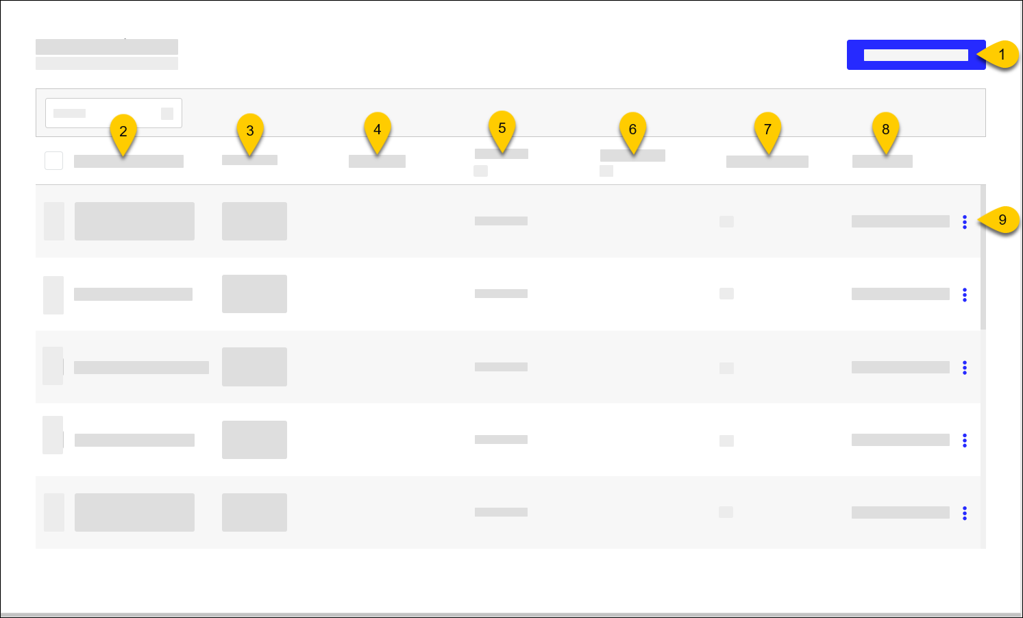 |
1 | Use Content Designer to configure display components, including images and videos. | |
2 | Content Design Name | Name of Content Design |
3 | Thumbnail | Content Design thumbnail for easy identification |
4 | Description | Description of Content Design |
5 | Resolution | Screen resolution Select All from the column header to filter the list by resolution. |
6 | Components | Lists the components included with design (e.g. Donation, Tip Screen) |
7 | Content Layouts | Number of Content Layouts mapped to the Content Design Select the number to view the mapped layout names. |
8 | Last Update | Date/time the Content Design was last updated |
7 | 3-Dot Menu | From the dropdown, select an action to perform on the Content Design:
|
Content Designer Overview
→ → → →
Use Content Designer to Create Content Design to display on a screen.
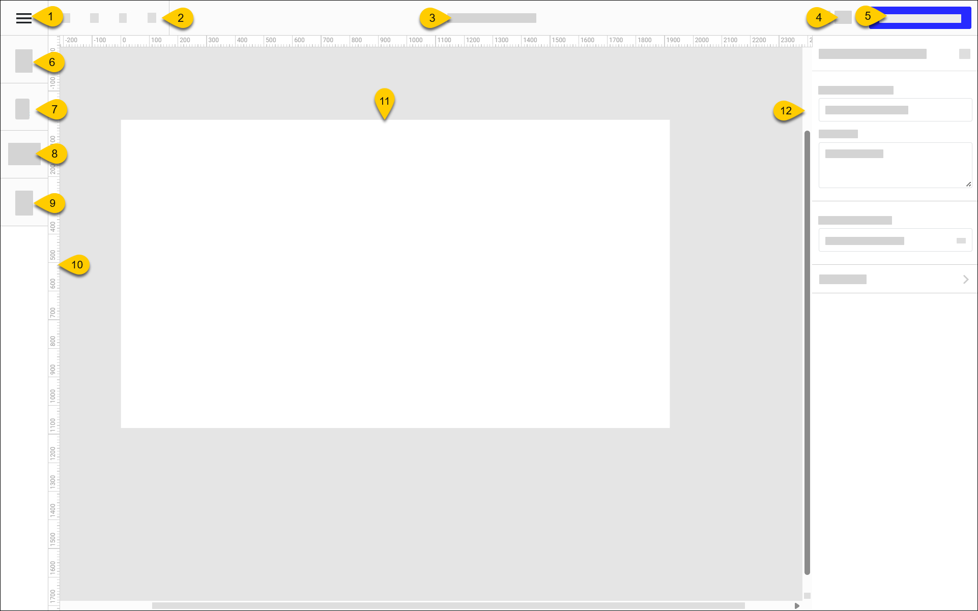 |
1 | "Hamburger" Menu | Select the "hamburger" icon to access the following options:
| ||||||||||||
2 | Toolbar | From the toolbar, access the following tools:
| ||||||||||||
3 | Content Design Name | Name of Content Design Specify the name in the Content Design Name field of Content Design Settings. | ||||||||||||
4 | Zoom Settings | From the dropdown, select a zoom setting:
| ||||||||||||
5 | Preview Content Design | Preview the Content Design in a separate browser tab. | ||||||||||||
6 | Add Media | Upload image and video files and configure their size and location on the screen. | ||||||||||||
7 | Add Text | Add text components and define their size, location, font, and color. | ||||||||||||
8 | Add Component | Add and format the following components:
| ||||||||||||
9 | Manage Layers | Open the Layers pane of the Content Designer and manage the content layers of the current screen. | ||||||||||||
10 | Ruler | When Show Rulers is enabled from the "Hamburger" menu, a ruler is displayed along the vertical and horizontal perimeters of the screen. | ||||||||||||
11 | Content Design Body | Provides a visual representation of the content. Select a component from the content to configure its respective settings. | ||||||||||||
12 | Component Settings | From this pane, configure settings for the selected component. |


Preview Content Design
To preview the content design:
From the upper-right of the Content Designer, select Preview Content Design to see a preview in a separate browser window.
From Views in the upper-left, select a view of the content design to preview.
Edit Content Design
→ → → →
To edit the properties and components of a Content Design:
From the Content Designs homepage, select the square to the left of the Content Design.
In the Search field in the upper-right, type the name to quickly locate the Content Design from the list.
From the Actions dropdown, select Edit.
From the Content Designer, edit the components as needed.
From the upper-left of the Content Designer, select the "hamburger" icon.
From the dropdown, select Exit Content Design.
Delete Content Design
→ → → →
Nota
All Content Layout assignments must be removed first.
To delete Content Design:
From the Content Designs homepage, select the square to the left of the Content Design.
In the Search field in the upper-right, type the name to quickly locate the Content Design from the list.
From the Actions dropdown, select Remove.
From the confirmation prompt, select Yes.
Duplicate Content Design
→ → → →
To copy the properties and components of a Content Design to create a new Content Design:
From the Content Designs homepage, select the Content Design to duplicate.
From the upper-left of the Content Designer, select the "hamburger" icon.
From the dropdown, select Duplicate Content Design.
The Content Designer opens the duplicate content in a separate browser window. "Copy" is appended to the name of the duplicate content.